The CTO Dashboard 2026: 12 Engineering Metrics That Belong on Your Top View

Gartner estimates that fewer than 30% of engineering leaders have effective visibility into their team's actual performance. Every CTO has a dashboard — most of them are useless. They're either crammed with dozens of charts that nobody reads, or they're a single graph of velocity that tells you nothing actionable. A good CTO dashboard answers three questions: Are we delivering? Are we healthy? Are we improving? Here's how to build one that actually works.
{/* truncate */}
The Three Layers of a CTO Dashboard
Your dashboard needs to serve three different audiences at three different cadences:
| Layer | Audience | Cadence | Time Spent |
|---|---|---|---|
| Executive Layer | CEO, CFO, Board | Monthly/Quarterly | 2 minutes |
| Leadership Layer | You + VP Engs | Weekly | 10 minutes |
| Operational Layer | You + EMs | Daily/On-demand | As needed |
The mistake most CTOs make is showing the operational layer to executives. Your CEO doesn't need to see PR cycle time per team. They need to know if engineering is delivering on commitments and if the investment is paying off.
Layer 1: The Executive Dashboard
This is what you show at the weekly leadership meeting, board reviews, and quarterly business reviews. Maximum 6 metrics. If an executive needs more than 2 minutes to understand engineering's status, you've failed.
Metric 1: Delivery Index (Org-wide)
What it is: A composite score (0.0 to 1.0) measuring how consistently engineering delivers against its commitments.
How to read it:
- 0.85+ — Engineering is highly predictable. Commitments are being met. Leadership can plan around engineering timelines with confidence.
- 0.65-0.85 — Normal operating range. Some variance, but generally on track. Investigate specific teams or projects that are pulling the average down.
- Below 0.65 — Delivery is unreliable. This is a leadership problem, not just a process problem. Dig into root causes: over-commitment, unclear requirements, technical debt, team instability.
What to say at the weekly:
"Delivery Index is at 0.81, up from 0.76 last month. The Platform team pulled us down with the database migration running 2 weeks over — we've since re-scoped the remaining milestones. Product teams are at 0.88."
Metric 2: DORA — Lead Time for Changes
What it is: The time from first commit to production deployment, measured in 4 stages: coding, PR review, CI/CD, and deployment.
How to read it (thresholds aligned with DORA benchmarks from the Accelerate State of DevOps research):
- Under 1 day — Elite. You're deploying fast and your pipeline is healthy.
- 1 day to 1 week — High. Solid performance for most organizations.
- 1 week to 1 month — Medium. Bottlenecks exist — find them in the 4-stage breakdown.
- Over 1 month — Low. Serious process or technical issues. This is a strategic risk.
What to say at the weekly:
"Lead time is 18 hours on average. The bottleneck is code review at 8 hours — we've started a working group to address reviewer availability."
Metric 3: Planning Accuracy
What it is: How closely actual delivery matches planned delivery for the sprint/cycle.
How to read it:
- Above 80% — Strong planning discipline. Teams understand their capacity.
- 60-80% — Room for improvement. Likely over-committing or dealing with unplanned work.
- Below 60% — Planning is broken. Either estimates are wildly off, or scope changes constantly.
What to say at the weekly:
"Planning accuracy is 73% this sprint. The gap is mainly from the unplanned security patch that consumed 3 days of the backend team. Without the incident, we'd be at 86%."
Metric 4: Productivity Score (Org-wide)
What it is: A normalized score combining Activity Time, Focus Time, and output metrics to give an overall picture of engineering productivity.
How to read it: Track the trend, not the absolute number. A rising trend means your investments in tooling, process, and team health are paying off. A declining trend is an early warning signal.
What to say at the weekly:
"Productivity Score is up 7% quarter-over-quarter. We attribute this to the IDE upgrade and the new no-meeting Wednesday policy."
Metric 5: Engineering Cost per Feature/Project
What it is: Total engineering cost (salaries, infrastructure, tooling) allocated to specific projects or features.
How to read it: This is the metric your CFO cares about most. It answers: "Are we spending our engineering budget on the right things?"
What to say at the weekly:
"Project Falcon consumed $180K in engineering cost this quarter — on budget. Project Atlas is at $95K against a $70K budget due to scope expansion; we're flagging this for a scope review."
Metric 6: Team Health Indicator
What it is: A composite of signals including overtime patterns, attrition risk, and developer satisfaction.
How to read it:
- Green — Team is sustainable. Normal hours, stable composition, positive trends.
- Yellow — Warning signs. Overtime increasing, or Focus Time declining, or one team is struggling.
- Red — Intervention needed. Burnout signals, key person risk, or team instability.
What to say at the weekly:
"Overall team health is green. One yellow flag: the Infrastructure team has shown increasing after-hours work for 3 weeks. I'm meeting with their manager to redistribute load."
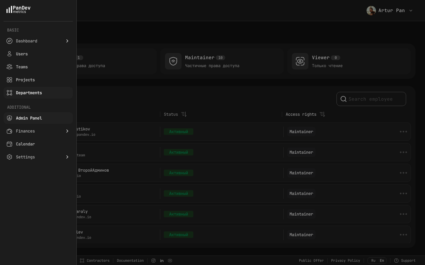 PanDev Metrics admin panel — manage who has access to what: Owner, Maintainer, and Viewer roles give you granular control over dashboard visibility.
"As a CTO and for our tech leads, it's important to see not individual employees but the state of the development process: where it's efficient and where it breaks down. The product allows natively collecting metrics right from the IDE, without feeling controlled or surveilled." — Maksim Popov, CTO ABR Tech (Forbes Kazakhstan, April 2026)
Layer 2: The Leadership Dashboard
This is what you review weekly with your VP Engs and senior managers. It goes deeper than the executive layer but stays strategic.
Team-Level Breakdown
| Team | Delivery Index | Lead Time | Planning Accuracy | Focus Time Avg | Health |
|---|---|---|---|---|---|
| Product - Web | 0.88 | 14 hrs | 82% | 3.1 hrs | Green |
| Product - Mobile | 0.79 | 22 hrs | 71% | 2.4 hrs | Yellow |
| Platform | 0.72 | 31 hrs | 65% | 2.8 hrs | Yellow |
| Infrastructure | 0.91 | 8 hrs | 88% | 3.4 hrs | Yellow |
| Data | 0.85 | 19 hrs | 77% | 2.9 hrs | Green |
How to read this table:
- Look for outliers, not averages. Platform team's lead time at 31 hours is the story here.
- Correlate metrics. Mobile's low Focus Time (2.4 hrs) and low planning accuracy (71%) are likely related — too many interruptions are breaking their ability to deliver on commitments.
- Health yellow + good metrics (like Infrastructure: 0.91 delivery but yellow health) means the team is delivering through unsustainable effort. This is the most dangerous pattern — it looks fine until someone quits.
DORA 4-Stage Breakdown
| Stage | This Week | Last Week | Trend | Target |
|---|---|---|---|---|
| Coding Time | 6.2 hrs | 5.8 hrs | ↑ | < 8 hrs |
| PR Review | 8.1 hrs | 7.4 hrs | ↑ | < 4 hrs |
| CI/CD | 0.8 hrs | 0.9 hrs | ↓ | < 1 hr |
| Deploy | 2.9 hrs | 3.1 hrs | ↓ | < 2 hrs |
| Total Lead Time | 18.0 hrs | 17.2 hrs | ↑ | < 15 hrs |
How to read this:
- Coding time increasing slightly — check if PRs are getting larger (bad) or if features are more complex (context-dependent).
- PR review is the bottleneck and getting worse. This needs a specific action: reviewer rotation? Smaller PRs? More reviewers?
- CI/CD and deploy are healthy and improving — good.
Investment Allocation
Track where engineering time is actually going vs. where you planned:
| Category | Planned % | Actual % | Delta |
|---|---|---|---|
| New Features | 60% | 48% | -12% |
| Technical Debt | 15% | 12% | -3% |
| Bug Fixes | 10% | 18% | +8% |
| Unplanned / Incidents | 5% | 14% | +9% |
| Process / Meetings | 10% | 8% | -2% |
How to read this: You planned to spend 60% on new features but only achieved 48%. The gap was eaten by bugs (+8%) and unplanned work (+9%). This is your argument for investing in quality and reliability — you're paying for it regardless, just in an uncontrolled way.
Layer 3: The Operational Dashboard
This is for your daily check-ins and deep dives. It's not for presenting — it's for investigating.
What to Monitor Daily
- Deployment frequency — are teams shipping, or is something stuck?
- Failed deployment rate — if it spikes, something is wrong in CI or testing
- Active incidents — what's on fire right now?
- PR queue depth — are reviews backing up?
What to Investigate Weekly
- Individual developers with anomalous patterns — sudden drops in Activity Time, sustained low Focus Time
- Project cost vs. budget — catch overruns early
- Cross-team dependencies — are teams blocked waiting on each other?
What to Review Monthly
- Department-level trends — compare this month to last month across all key metrics
- Role-based analysis — are senior developers spending too much time on reviews? Are juniors getting enough Focus Time?
- Hiring impact — are new hires ramping up on schedule?
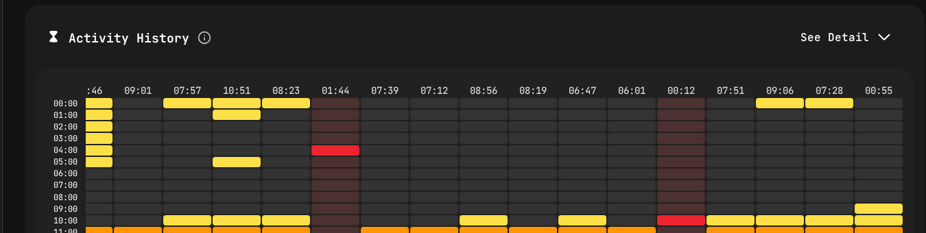 Activity heatmap from PanDev Metrics — the operational layer drill-down. Yellow blocks show active coding by hour and day, helping identify patterns without micromanaging.
How to Read Your Dashboard Without Micromanaging
This is the hardest part. The temptation with a good dashboard is to react to every fluctuation. Don't.
The 3-Week Rule
Never act on a single week of data. Engineering work is inherently variable. A team might have low delivery one week because they're in a design phase, and that's perfectly healthy.
Pattern to act on: Three consecutive weeks of the same trend direction. Pattern to ignore: One bad week followed by recovery.
The Context Check
Before flagging a metric to your team, always ask: "Do I know the context?"
- Low Activity Time might mean a design sprint, offsite, or holiday week
- High lead time might mean a deliberately careful rollout of a critical feature
- Low planning accuracy might mean the team absorbed unplanned work that was strategically important
Rule: Ask the EM for context before forming conclusions. Your dashboard tells you what; the EM tells you why.
The Right Altitude
| You see... | Wrong response | Right response |
|---|---|---|
| One developer's Activity Time dropped | Message the developer | Note it; check if their EM is aware at your next sync |
| A team's delivery dipped for 2 weeks | Demand an explanation in the all-hands | Ask the EM in your 1:1 |
| Org-wide lead time has been rising for a month | Ignore it (it's just a metric) | Start a working group to investigate |
| Cost per project is over budget | Cut the project | Review scope with the PM and EM; understand the overrun |
Building Your Dashboard: A Practical Guide
Step 1: Start With the Executive Layer
Don't try to build all three layers at once. Start with the 6 executive metrics. If you can't answer "Are we delivering? Are we healthy? Are we improving?" — nothing else matters.
Step 2: Add Team-Level Breakdown
Once executive metrics are stable, break them down by team. This is your leadership layer.
Step 3: Enable Self-Service for Operational Data
EMs should be able to drill into their own team's data without asking you. Developer dashboards should be accessible to the developers themselves. Your operational layer should be primarily for cross-team and org-level investigation.
Step 4: Automate Reporting
Set up weekly automated reports:
- Monday: Dashboard snapshot emailed to your leadership team
- Monthly: Executive summary generated for the leadership meeting
- Quarterly: Full report with trends for board review
Generating Excel or PDF reports from your engineering intelligence platform saves hours of manual number-crunching.
Step 5: Iterate Based on Questions
The best dashboards evolve based on the questions people ask. If every weekly meeting includes "but what about X?" — add X to the dashboard. If nobody ever looks at metric Y — remove it. Aim for signal, not noise.
The Weekly Meeting Flow
Here's how to actually present your dashboard in a 15-minute weekly leadership slot:
Minutes 1-2: Executive Summary "Delivery Index is 0.81. Lead time is 18 hours. Planning accuracy is 73%. We're on track with one yellow flag."
Minutes 3-5: The Story "The story this week is unplanned work. We absorbed a critical security patch that cost us 3 days on the backend team. Without it, planning accuracy would be 86%. I've asked the security team to add a buffer to sprint planning for exactly this scenario."
Minutes 6-8: Team Highlight "I want to call out the Mobile team — they've improved lead time from 35 hours to 22 hours over the past month by splitting their monolith deploy into feature-based releases."
Minutes 9-12: Decisions Needed "Platform team's lead time at 31 hours is a concern. I'd like to propose dedicating 2 engineers to pipeline automation for 4 weeks. Expected impact: reduce lead time to under 20 hours."
Minutes 13-15: Questions Open floor.
This structure respects executive time, highlights what matters, and drives decisions. It's consistent with the approach Nicole Forsgren recommends in Accelerate: lead with outcomes, explain the story behind the data, then focus on what needs to change.
Get a CTO dashboard that actually works. PanDev Metrics provides all three layers out of the box — executive summaries, team breakdowns, and operational drill-downs. With DORA metrics, Delivery Index, cost analytics, and role-based access, every stakeholder sees exactly what they need. Export weekly reports to PDF or Excel for your leadership meetings.