FTE Utilization vs Hours Logged: One Metric Lies

A team of 8 engineers logged 1,280 hours in March 2026. That is exactly what a 160-hour-per-FTE month should produce. The spreadsheet looked clean. Two engineers were three weeks from quitting. The hours number hid that completely; FTE utilization showed it on day five.
This is the gap between an attendance metric and an engagement-against-baseline metric. Microsoft Research's 2022 WorkLab study on the "triple peak workday" documented a third evening productivity spike pushing knowledge workers past sustainable hours, and that signal stays invisible if you only count totals. Hours don't tell you who is sprinting and who is coasting. FTE utilization does.
{/* truncate */}
Why hours logged is a comfort metric
"The team logged 1,280 hours" is the engineering version of "we shipped 47 tickets." It looks like a measurement. It's a tally.
A tally tells you nobody disappeared. It does not tell you:
- Whether the load was balanced
- Whether anyone was sustained above 50 hours per week
- Whether someone with paid PTO actually rested
- Whether the velocity came from five people working too hard, or eight people working sustainably
Stanford economist John Pencavel's 2014 study on working hours and productivity is still the cleanest evidence on this. Output rises with hours up to about 49 per week. Past 55, output per hour falls so sharply that 70-hour weeks produce roughly the same total as 56-hour weeks. The extra 14 hours are pure cost. Hours-logged reporting cannot see this break. Utilization reporting can.
How PanDev calculates FTE utilization
The formula is intentionally boring:
utilization = avgMonthlySeconds / (160h × 3600)
avgMonthlySeconds comes from IDE telemetry: heartbeat-based active editing time, not "I had the laptop open." 160h × 3600 is the standard FTE baseline (40h × 4 weeks). For employees with custom schedules (parental leave at 50%, contractors on 4-day weeks, leads with formal 30% management time) the denominator is overridden via CustomEmployeeWorkingTime, so a 50% schedule reads against an 80h baseline, not 160.
The output goes into a heatmap with three zones:
| Zone | Range | What it means | Action |
|---|---|---|---|
| Green | <70% | Underutilized. Slack capacity. | Absorb new work, mentor, run experiments |
| Orange | 70–90% | Healthy. Sustainable load. | Protect this band |
| Red | >90% | Sustained overload. Burnout risk. | Investigate same week, redistribute |
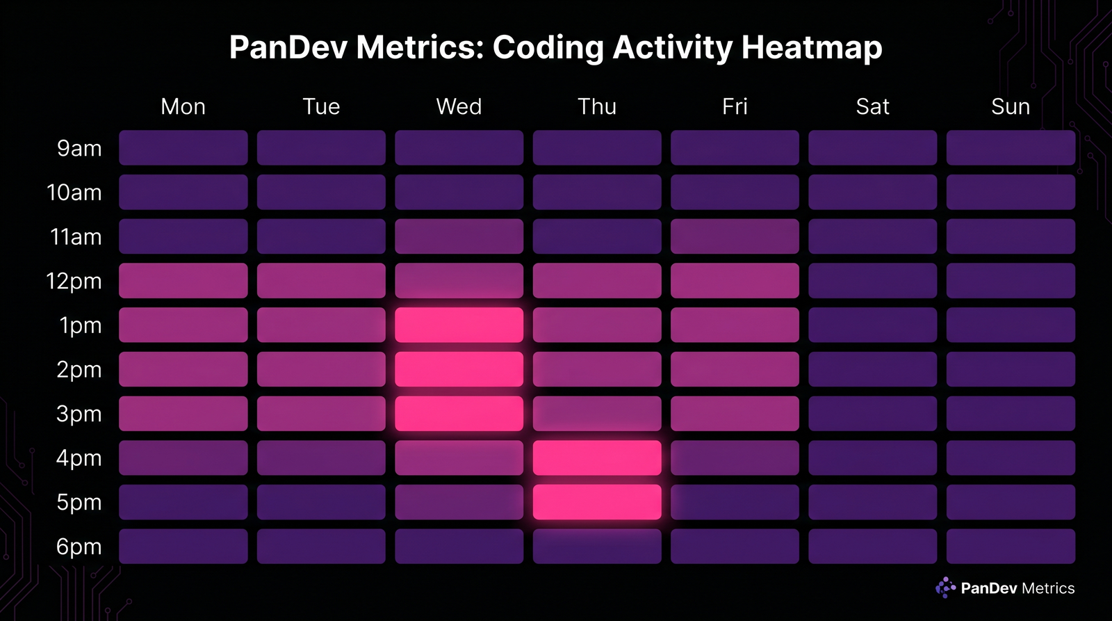
The widget renders a scrollable per-day timeline with a fixed Y-axis, so a row that suddenly turns red mid-month is visible at a glance. We deliberately picked this layout over monthly averages because a single 95% month is rare; three in a row is a resignation in the making.
Worth saying flat: this is an attention-routing tool, not a verdict. A red cell is a question ("what happened that week?"), not a performance review.
Hours logged vs FTE utilization: same totals, different stories
Six engineers, same March, same 160h "logged":
| Engineer | Hours logged | Active IDE hours | Custom baseline | FTE utilization | Zone |
|---|---|---|---|---|---|
| Alex (senior) | 160h | 152h | 160h | 95% | Red |
| Maria (senior) | 160h | 148h | 160h | 93% | Red |
| James (mid) | 160h | 124h | 160h | 78% | Orange |
| Sarah (mid) | 160h | 118h | 160h | 74% | Orange |
| Daria (lead, 30% mgmt) | 160h | 98h | 112h | 88% | Orange |
| Tomás (parental 50%) | 80h | 72h | 80h | 90% | Orange |
Two reds in a "perfect" month. Daria looks fine because her baseline correctly accounts for management time. Without the override she'd read 61% and look like a slacker. Tomás logged half the hours but is closer to his ceiling than James and Sarah are to theirs. The average ("team logged 1,000 hours, that's normal") erases all of this.
This is the case for FTE utilization in one table. Hours give you a rectangle. Utilization gives you a heatmap.
Three team archetypes the heatmap exposes
Run the heatmap across 4 weeks for a team of 8. Three patterns repeat:
| Archetype | Zone distribution | What's actually happening |
|---|---|---|
| Hidden burnout | 60% red, 15% orange, 25% green | Two or three carriers absorbing the load while others coast. Velocity looks fine until a carrier quits. |
| High-performance | 10% red, 75% orange, 15% green | Most of the team in the 70–90% band. Reds are short and tied to a specific incident. Greens are intentional (leave, training). |
| Underutilized | 0% red, 30% orange, 70% green | Real capacity exists. Either headcount is over-provisioned, or work-intake is broken. Not a "lazy" team. A planning failure upstream. |
Hidden burnout is the dangerous one. It looks healthy on hours-logged dashboards because the carriers compensate for the coasters. The total is fine. The distribution is the problem. Gallup's State of the Global Workplace 2024 report puts global engagement at 23% and active disengagement at 15%. The average team has more disengaged than burnt-out members, but the burnt-out ones are the ones doing the work. Hours-logged math averages them together. FTE utilization separates them.
 Same team, same hours total. Weeks 1–2 show the hidden-burnout pattern: red carriers, green coasters. Weeks 3–4 after redistribution: variance compressed into the 70–82% band.
A real redistribution: 23% cycle-time improvement, zero new hires
A team of 8 engineers logged 1,280 hours in March 2026. The hours-logged report read "fully staffed month, on track." The FTE utilization heatmap told a different story:
- 5 engineers at 92–98% (red zone) for three weeks running
- 3 engineers at 45–55% (green zone), not on leave, not on training, just under-allocated
Their lead drilled down via /dashboard/finances/employee/:id for each red-zone engineer. Two were drowning in code review queues. Two were pulled into a regulator-driven security project nobody had reflected in the sprint plan. One was pair-debugging a flaky pipeline alone for 12 days.
The fix was unglamorous: reroute the security project's CR load to two of the green-zone engineers, and pair the flaky-pipeline owner with a third. By April the heatmap variance compressed into a 70–82% band across all 8.
Cycle time improved 23%. Headcount: zero new hires. The hours number was identical month-over-month. The shape of the hours was completely different, and shape is what predicts whether a team will still be there in Q4.
This is the same dynamic we covered in the overhead coefficient article: utilization feeds directly into the nontaskTotal calculation that shows up in cost-per-feature math. A team running red carries 1.3–1.5× the effective cost of an identically-sized team running orange, because the burnout tax compounds into churn within two quarters.
What FTE utilization does NOT measure
Worth saying clearly so nobody hangs their planning on a metric that can't carry it:
- It does not capture off-keyboard thinking. A staff engineer doing system design on a whiteboard for two hours reads as IDE-idle. Pair this metric with self-reported deep-work blocks for research-heavy and design-heavy roles. We covered the deep-work side in why two hours of uninterrupted code equals six.
- It does not measure code quality. A 95% red-zone engineer cranking out features may also be cranking out bugs. Look at this alongside review velocity from the 2026 code review checklist, not in isolation.
- It does not work for solo or open-source contributors. Our dataset is B2B engineering teams. Solo founders and OSS maintainers have entirely different rhythms: irregular bursts, asynchronous collaboration, no fixed FTE baseline.
- A single high-utilization week is noise. Three in a row is signal. The heatmap's strength is in the time series, not the snapshot.
How to act on what the heatmap shows you
For each zone, the playbook is short:
Red (>90% sustained ≥3 weeks): 1:1 same week. Don't make it a performance conversation. Make it a load conversation. Audit what they own: code review queue, on-call, project assignments, ad-hoc requests. Move at least one stream of work elsewhere within the next sprint. Re-check in two weeks.
Orange (70–90%): do nothing. This is the band you want 70–80% of the team in. Resist the urge to "optimize" people who are already where they should be.
Green (<70%): a question, not an accusation. Ask what's blocking. Is intake low? Are tickets sized wrong? Is the engineer waiting on review? Are they ramping after a transition? If none of those, that's actual slack capacity for new initiatives or mentorship.
The most common mistake we see: teams react to red zones by hiring. Hiring takes 4–6 months to land an effective engineer. Redistribution takes one sprint. Hire when redistribution stops working, not before.
The metric that would be on the wall in our office
If we had to pick one number to put on the engineering ops wall, it wouldn't be hours logged. It wouldn't even be average utilization. It would be share of team in red zone for ≥3 consecutive weeks.
Above 25%, you have a structural overload problem. Below 5%, you might be over-staffed. Between 5% and 15%, you're running healthy with a normal incidence of incidents and crunches. That single number predicts attrition risk, cycle time stability, and review queue health better than any vanity dashboard.
Hours logged tells you nobody disappeared. FTE utilization tells you who'll still be here in six months. Pick the one that answers a question worth asking.