PanDev in Screenshots: 4 Dashboards, Every Slice
· 4 min read

Four dashboards. One platform. From a single engineer's day to organisation-wide cost. Below — what each view shows, in screenshots.
{/* truncate */}
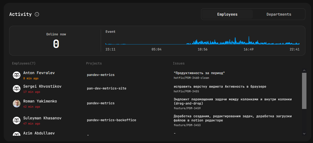
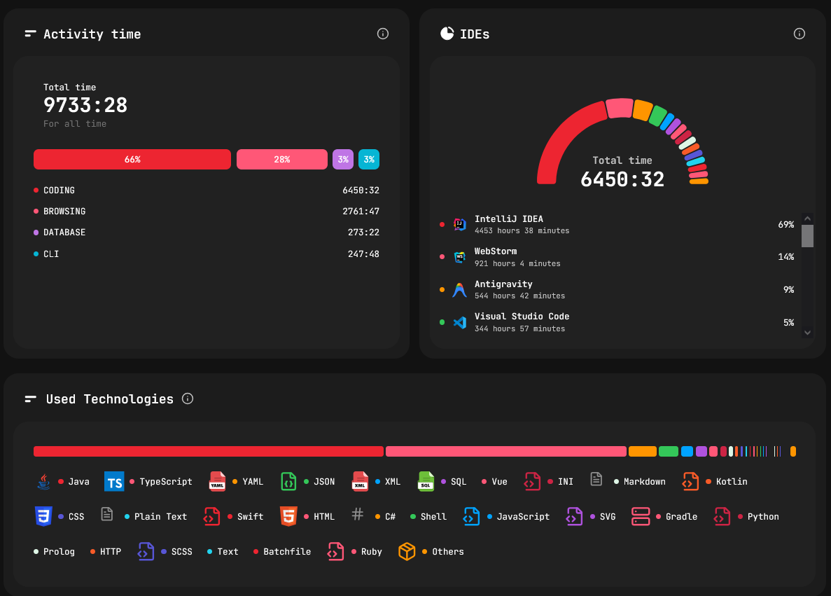
1. Home — organisation overview
/dashboard/home
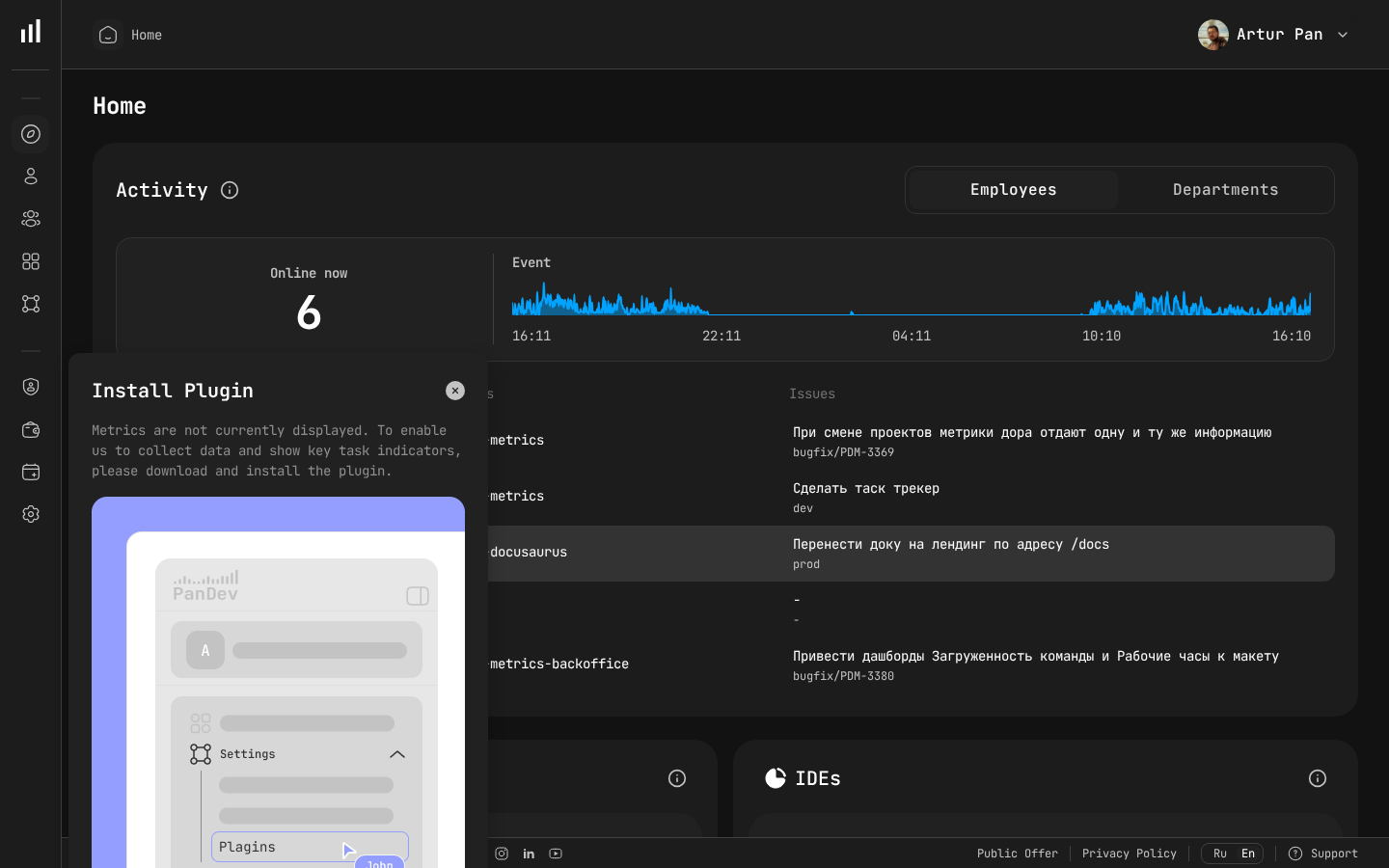
What's on the page:
- Who's online now — live list of active engineers / departments with health index, productivity, 30-day average activity.
- Activity time — stacked semicircle: Coding, Browsing, Database, Terminal, AI Coding.
- IDEs — share of IDE usage with period-over-period delta.
- Technologies — languages and frameworks ranked by usage time.
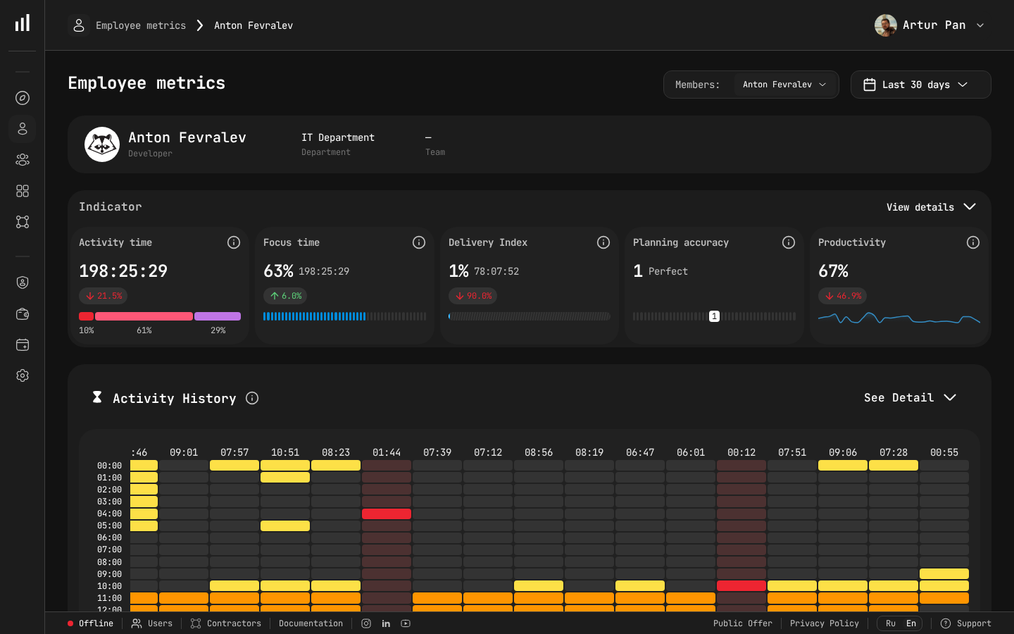
2. Employee dashboard
/dashboard/employees/:id

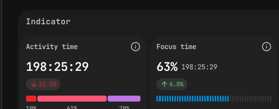
Per engineer, for any 90-day window:
- Profile — role, department, teams, last activity.
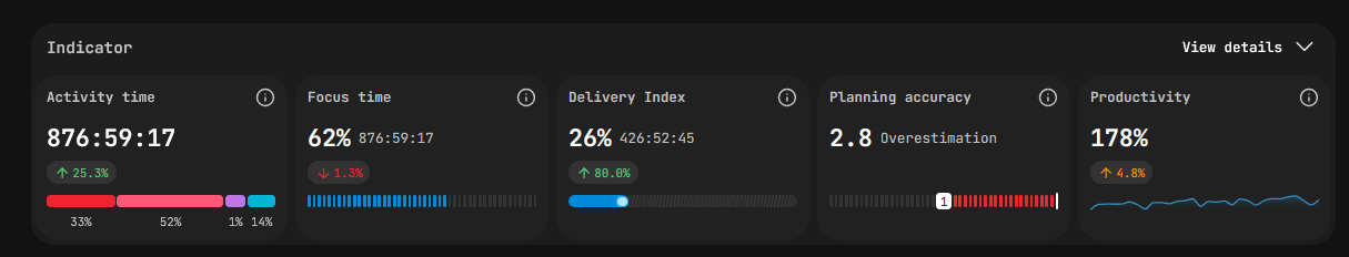
- 5 KPIs — Activity time, Focus time, Planning accuracy, Productivity, Delivery index.
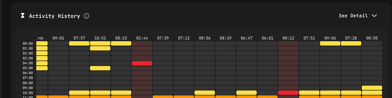
- Activity heatmap — calendar by day; click a cell for hourly breakdown.
- Day-by-day chart — stacked hours by activity type.
- AI usage — manual vs. AI-assisted code share.
- Tasks & Projects — pies + drilldowns.
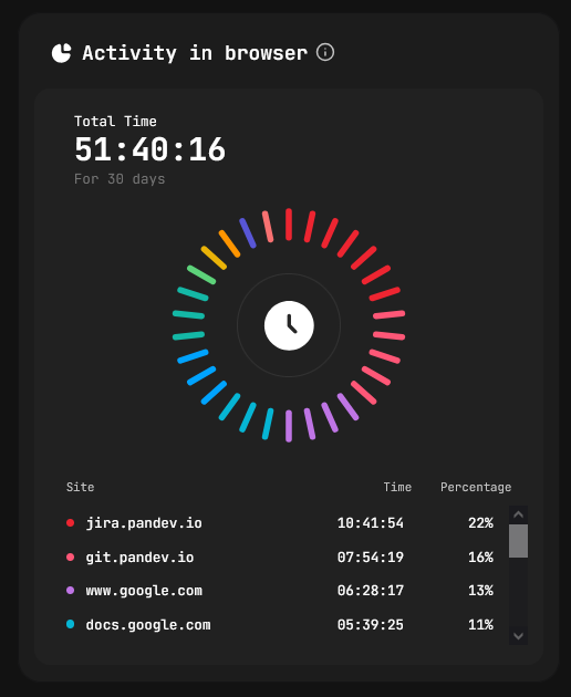
- Browsing — top sites by time.
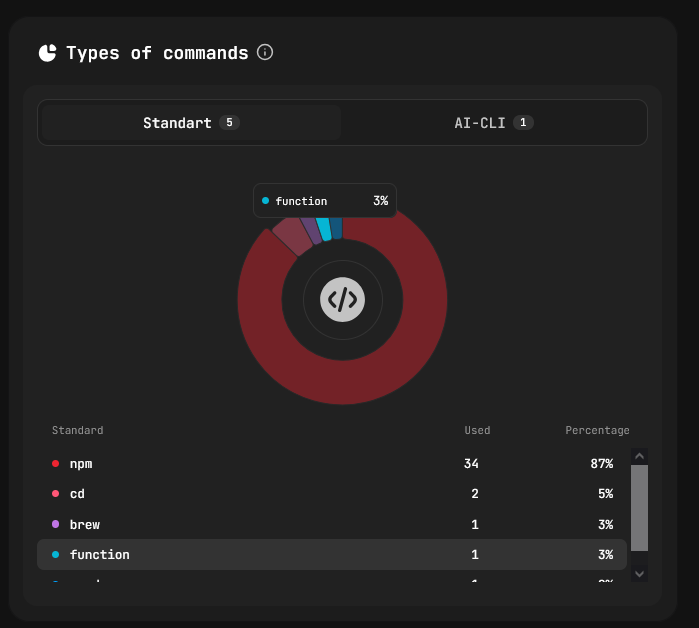
- CLI — Standard vs. AI-CLI command frequencies.
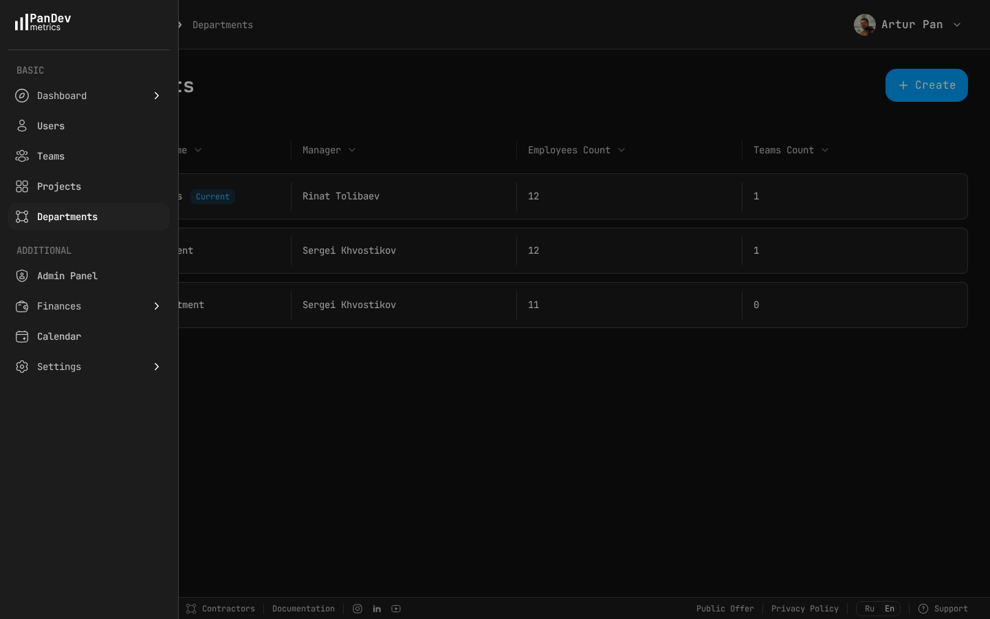
3. Department dashboard
/dashboard/metrics/department
Same KPIs as the employee view, aggregated:
- Productivity, Focus, Activity, Delivery, Planning — at department level.
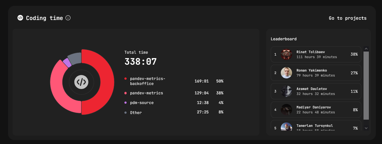
- Coding time per project — pie + sortable table (Project / Hours / Share %).
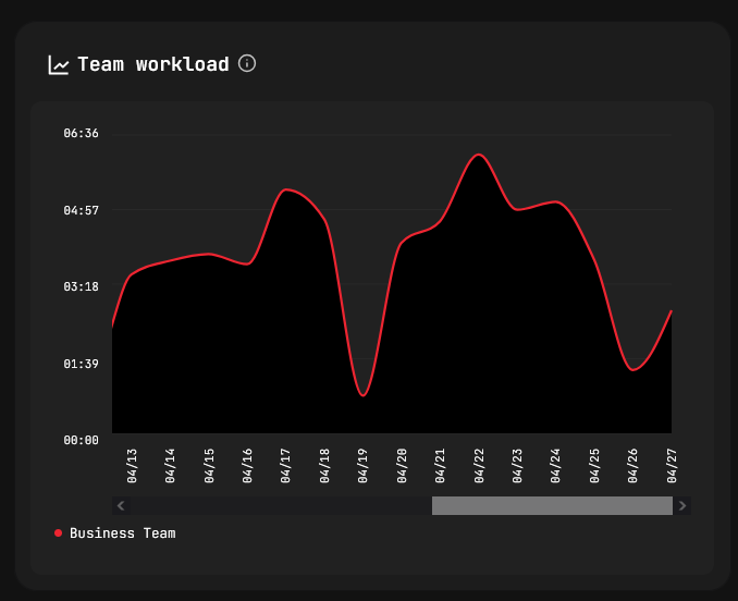
- Team load — index 0-100 over time, one line per team, click to isolate.
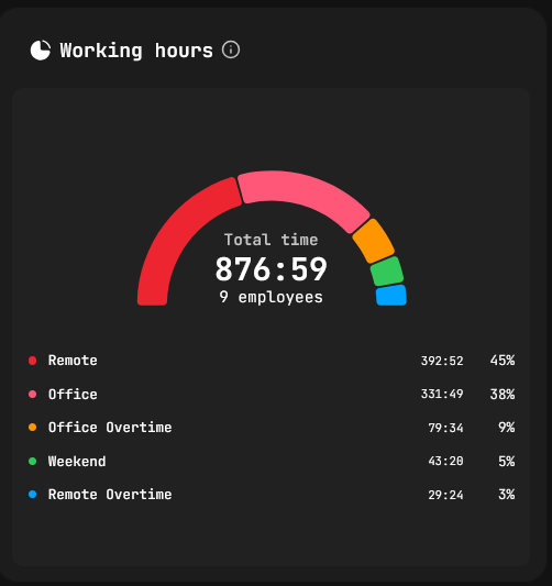
- Working hours — Office / Remote / Weekends split with headcount.
Date range: presets from "last day" to "last 12 months".
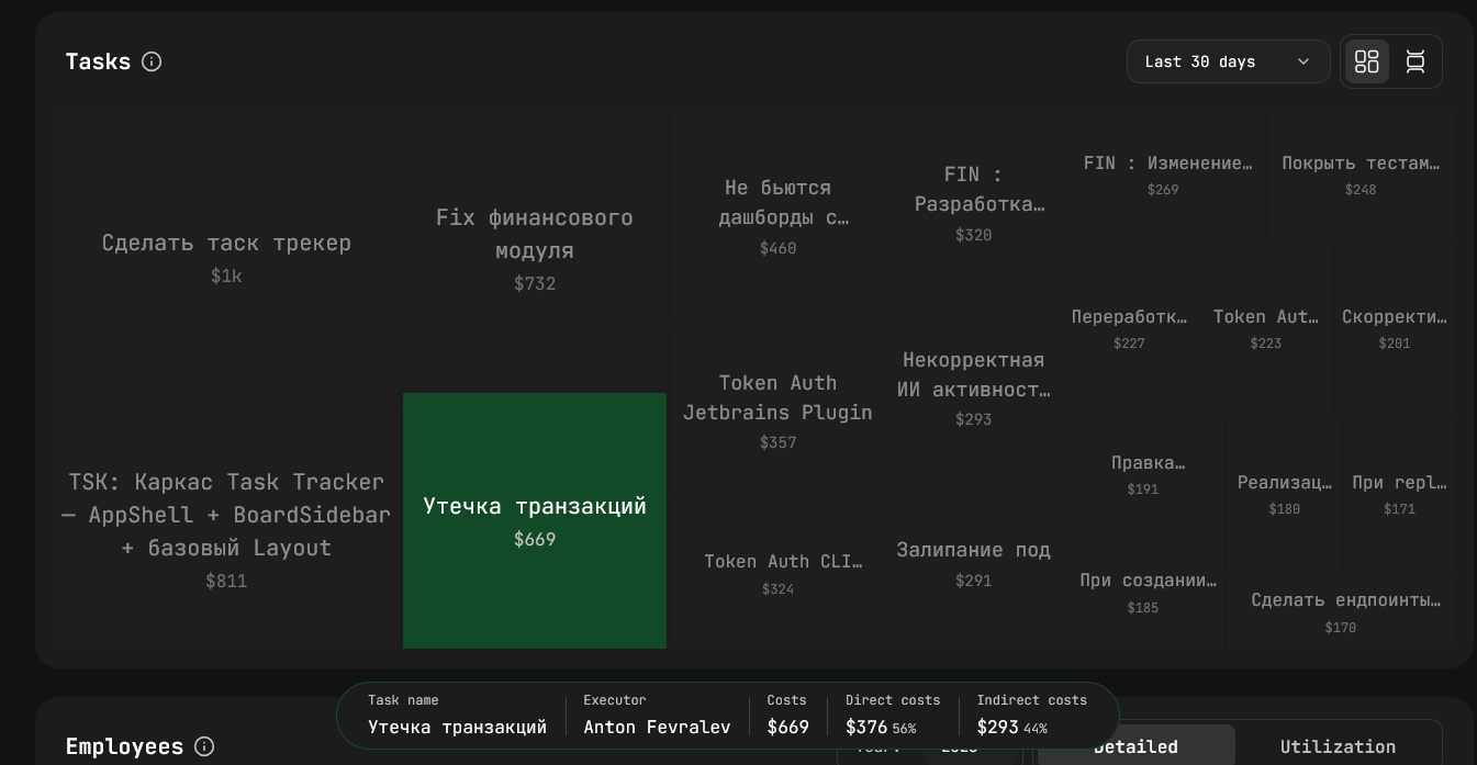
4. Finances
/dashboard/finances
Engineering activity translated into spend.
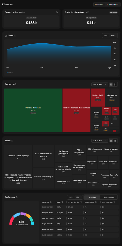
What's in there:
- Org costs — total + last 30 days.
- Costs by department — list or single-department view.
- Costs over time — months × spend, year selector.
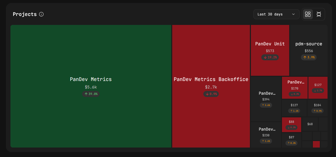
- Projects — mosaic (size = cost, colour = delta) or list (Project / Cost / Share %).
- Tasks — mosaic or list (Task / Assignee / Cost) + most-expensive-task callout.
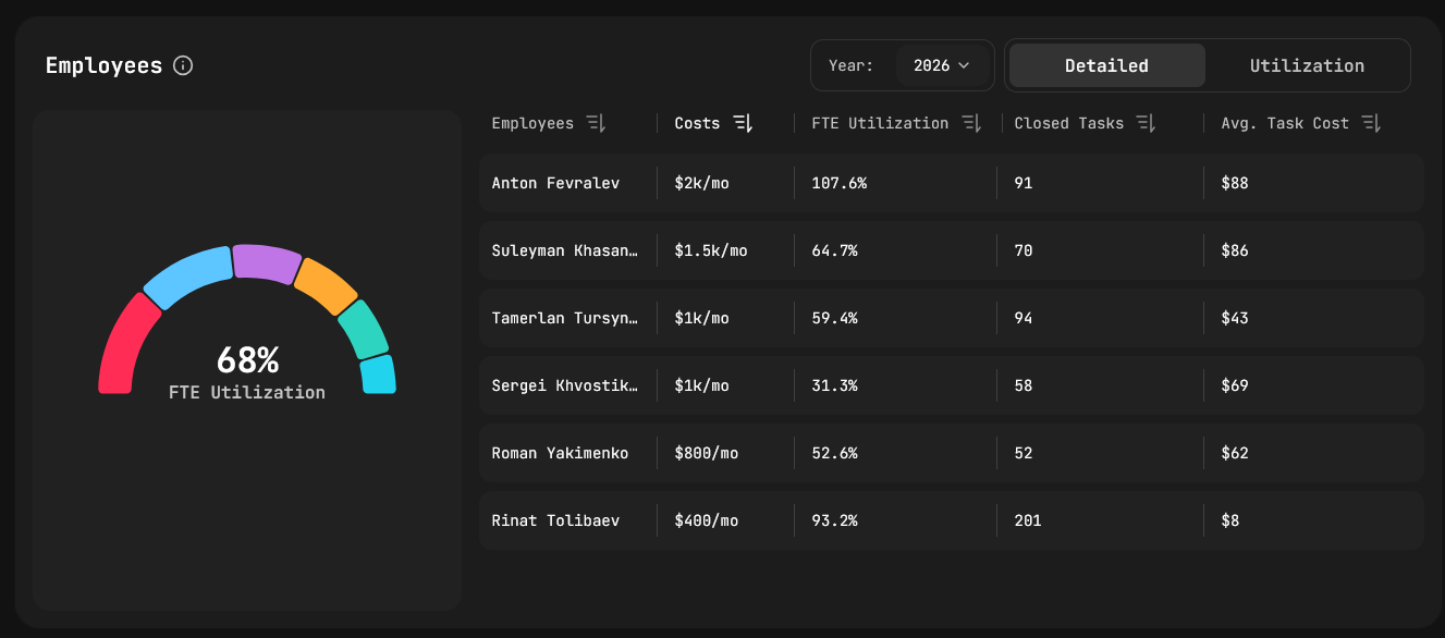
- Employees — Detailed (FTE gauge, cost / month, closed tasks, avg cost / task) and Utilisation tabs.
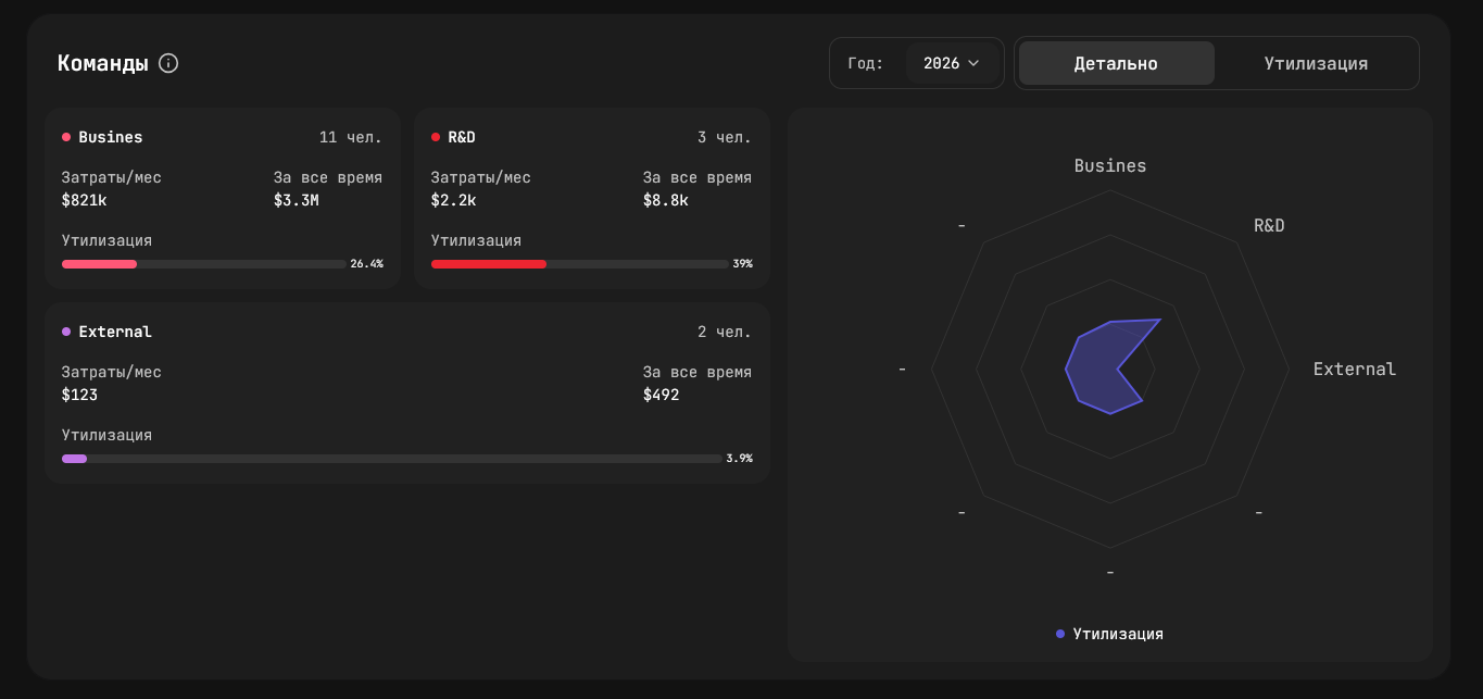
- Teams — Detailed cards and radar chart for cost vs. load.
Cuts available: department, period (30 days / all time), year.
TL;DR
| Dashboard | Question it answers |
|---|---|
| Home | Who's working right now and on what? |
| Employee | What did this engineer do, how productively? |
| Department | How is the team performing — load, focus, projects? |
| Finances | Where is the money going, per project / task / person? |
Want this on your data? Book a demo.